UI / UX design
Digital
Crypto
Web Application
Mobile
Desktop
Commercial 2019 | UI / UX design | Digital | Crypto | Web Application | Mobile | Desktop | Mobile
Financial services nowadays are monopolised by big tech and financial institutions. In most cases they don't provide enough values for users, but make money off users instead. hiDollars is aimed to change that. hiDollars is a cryptocurrency that allows users to save, earn and trade freely. A specialised web-based application is developed for it, which combines the functionality of a crypto exchange with a next-generation digital bank, providing members with an all-in-one platform for savings, investments, payments, and lifestyle benefits.
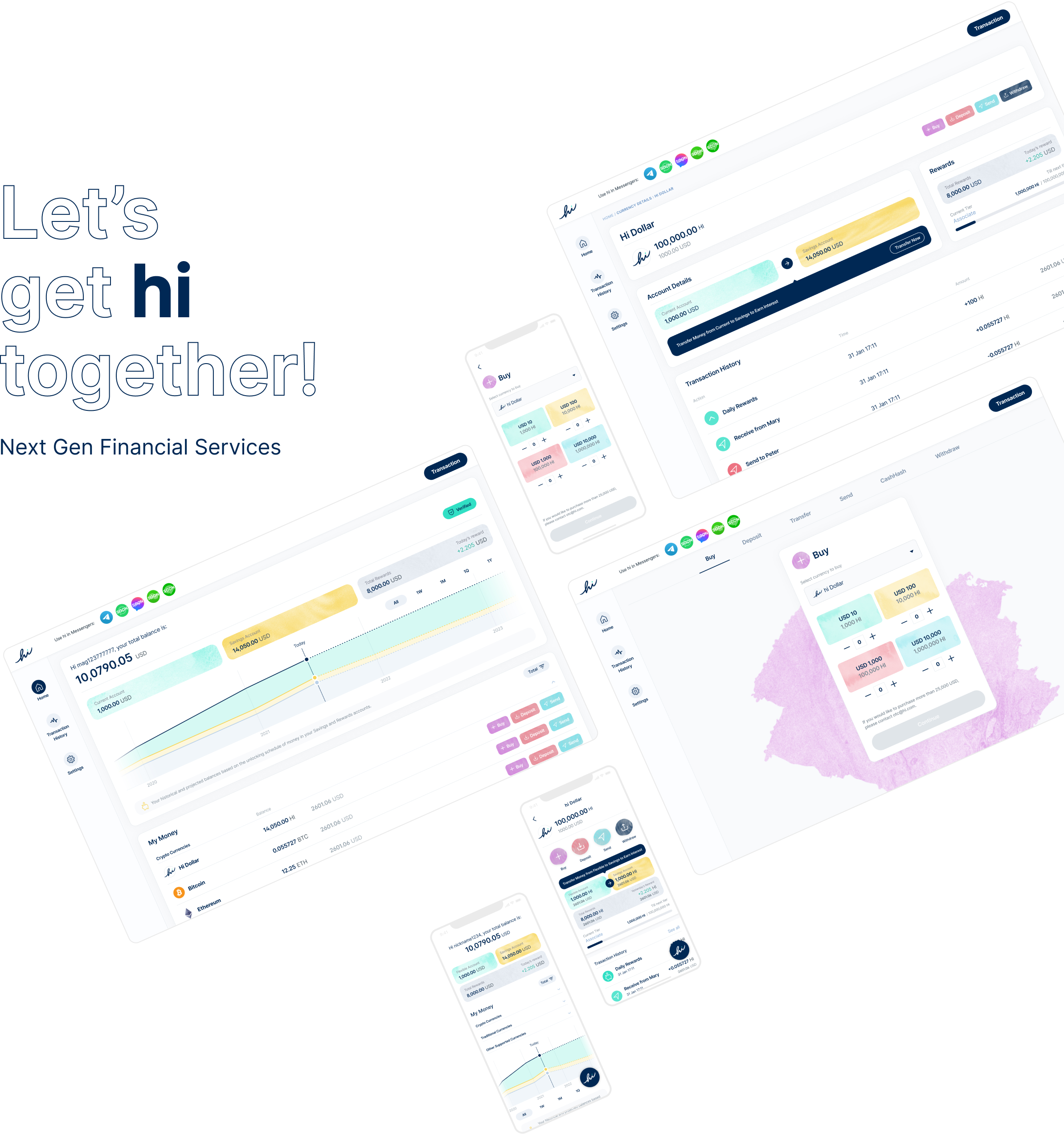
My task was to design the web app based on existing brand guidelines. A set of mobile and desktop application together with a CMS, with a total of 300+ screens, plus an app style guideline and component library were developed.
Today, tech and financial institutions make money off you, not for you. hiDollars is aimed to change that. Financial services should be a global public good. hiDollars is using blockchain to make this happen.
|
hi Dollars
Global, Not-for-profit, Member Centric
Great Rates
Enjoy up to 40% p.a.
No Fees or Markups
hi Dollars serve members and minimize fees and spreads
Instant Transactions
Technology-first allows hi Dollars to work in milliseconds
|
Traditional Institutions
More than 1 trillion USD in annual profits
Terrible Rates
Only around 0.01% p.a.
High Fees
Overdraft, transfer, late payment... any fees to drive profits
Snail Speed
Work in days and weeks
|
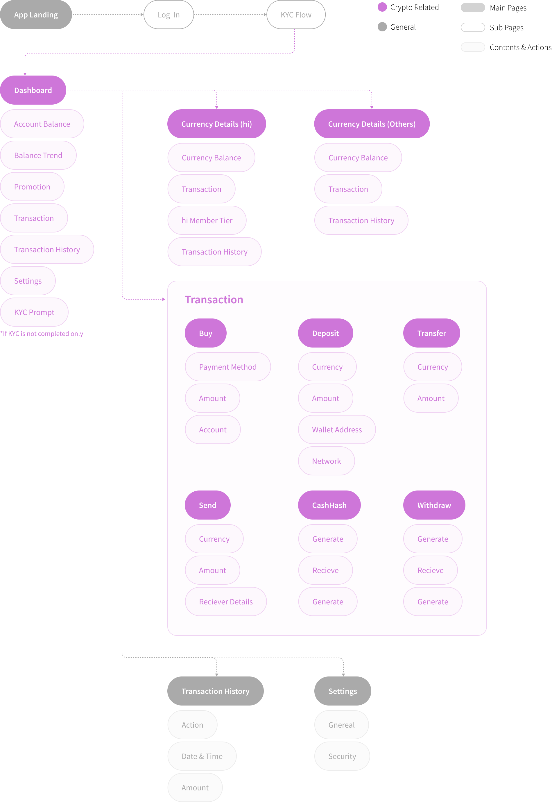
As the landing page of the app, the dashboard serves as an overview of the user's account. From the account saving amounts, saving trends, to all the crypto holdings, all can be easily found and digested.

By clicking a specific currency, the app will land to the currency details page, where users can find all the related savings, rewards and transaction details of the currency.

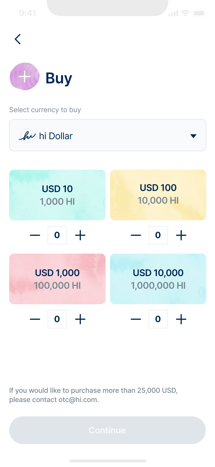
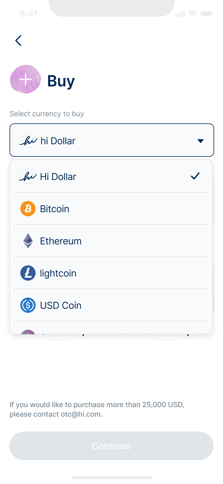
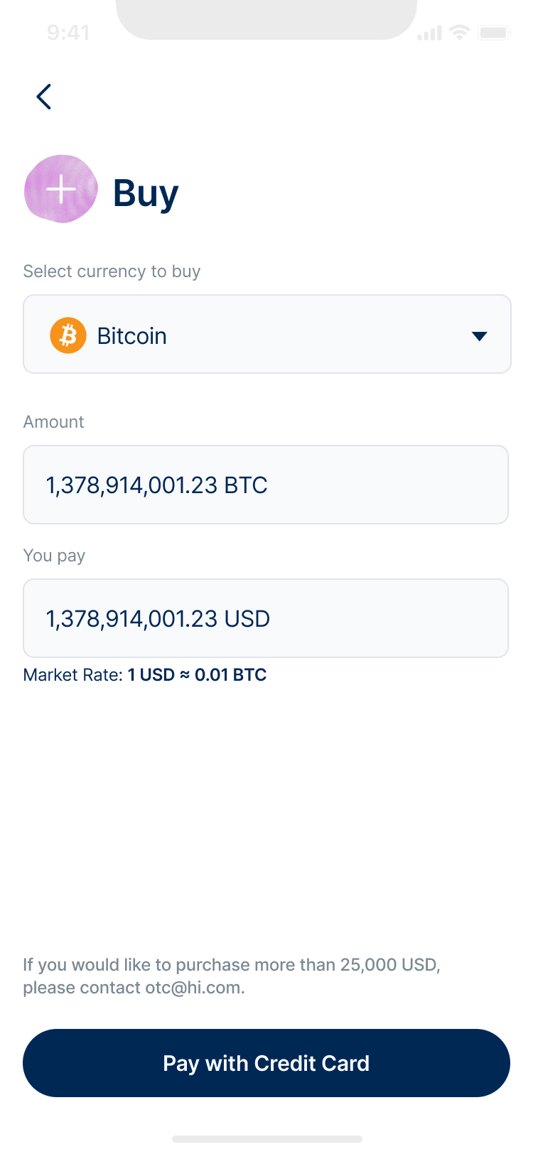
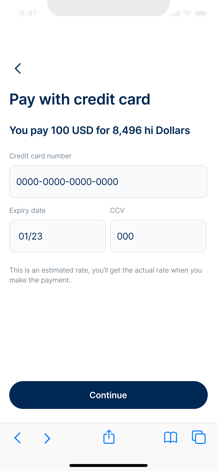
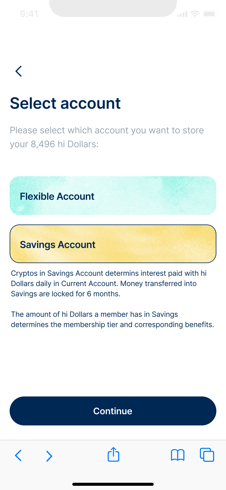
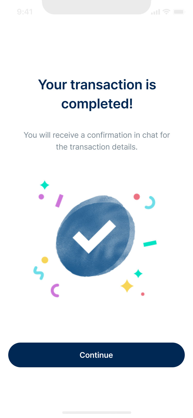
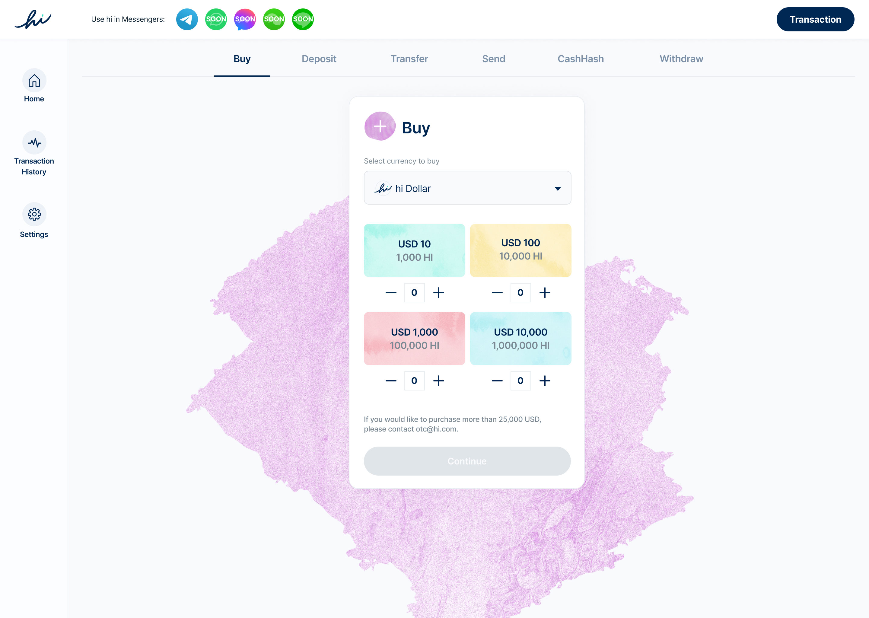
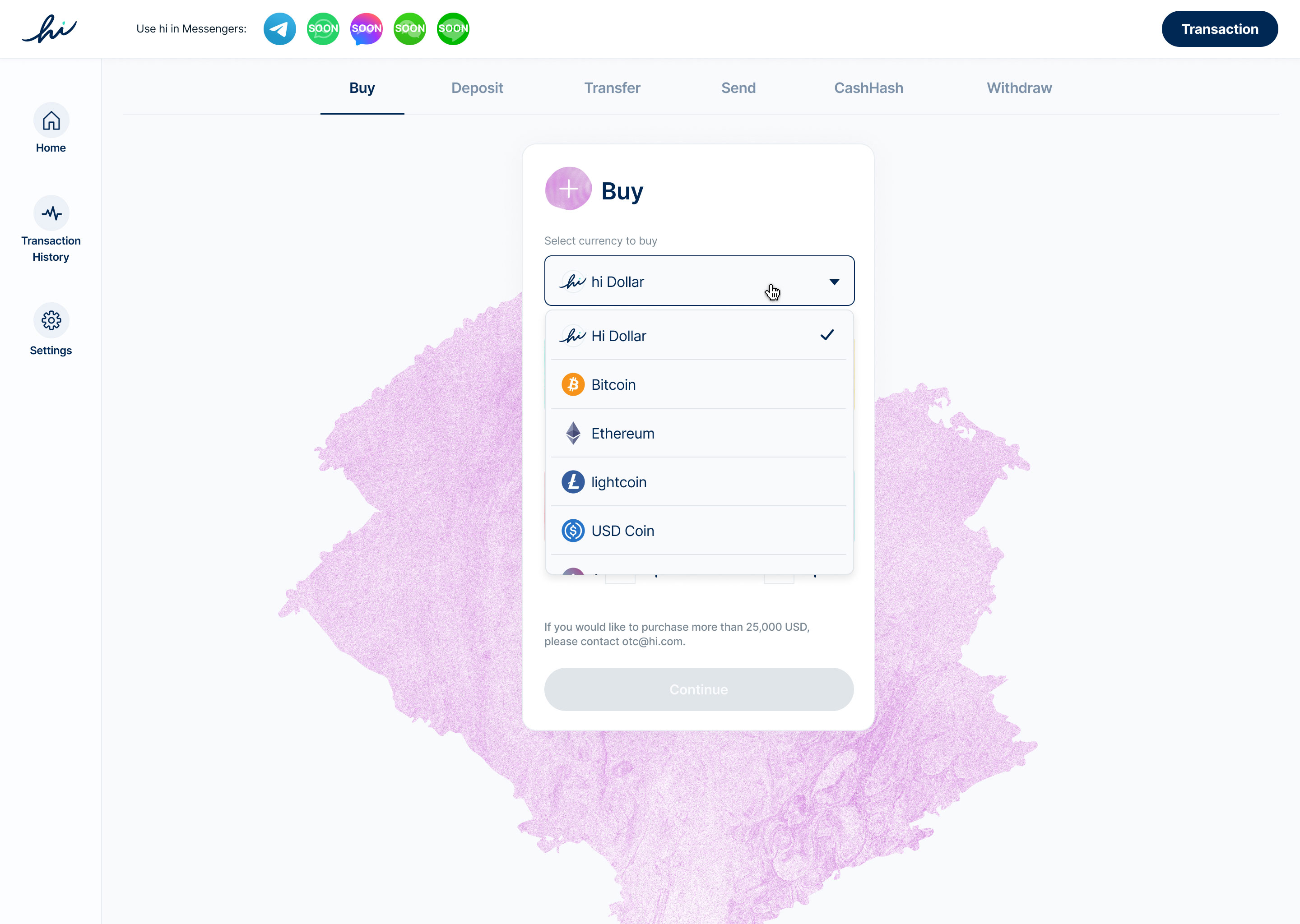
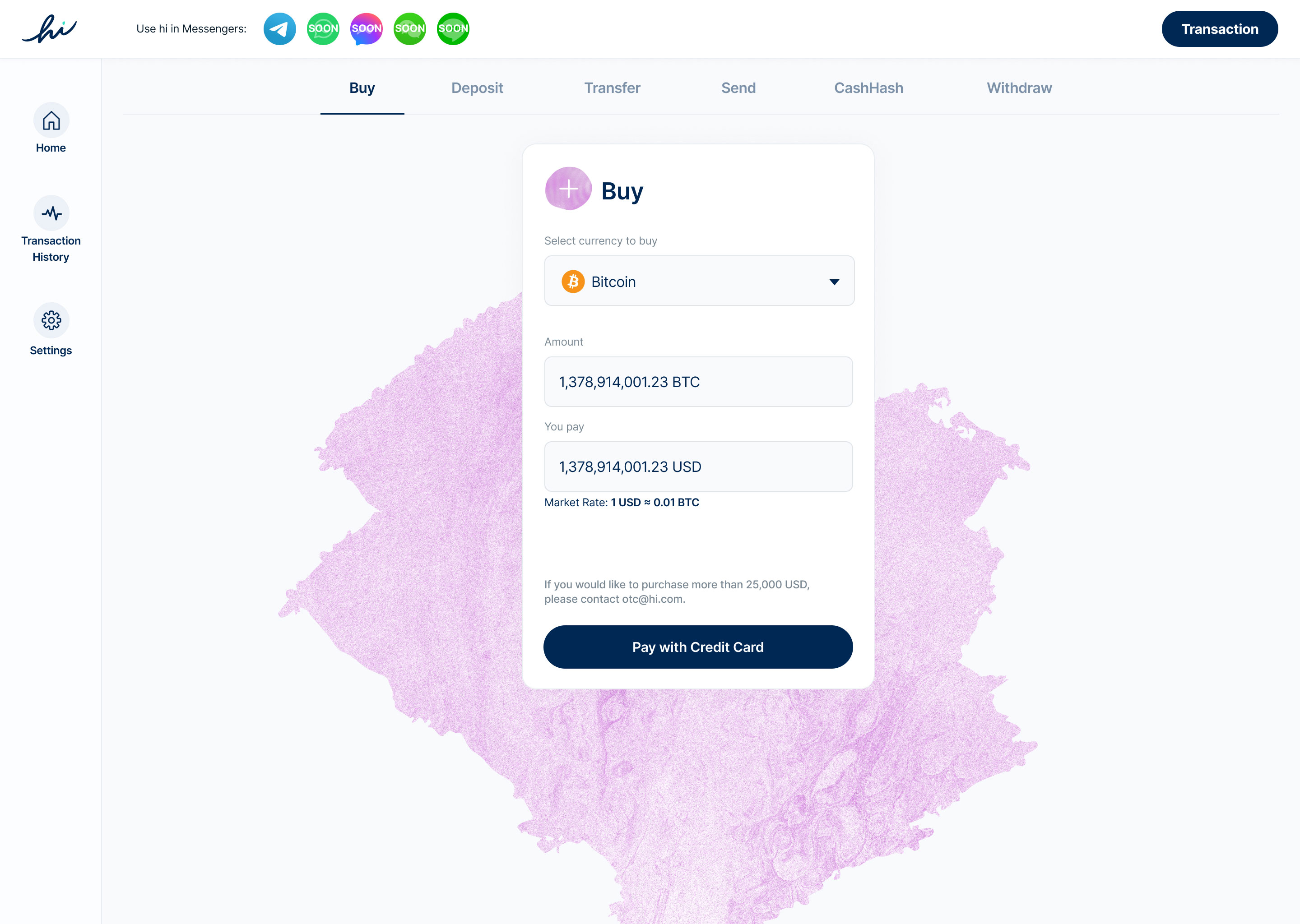
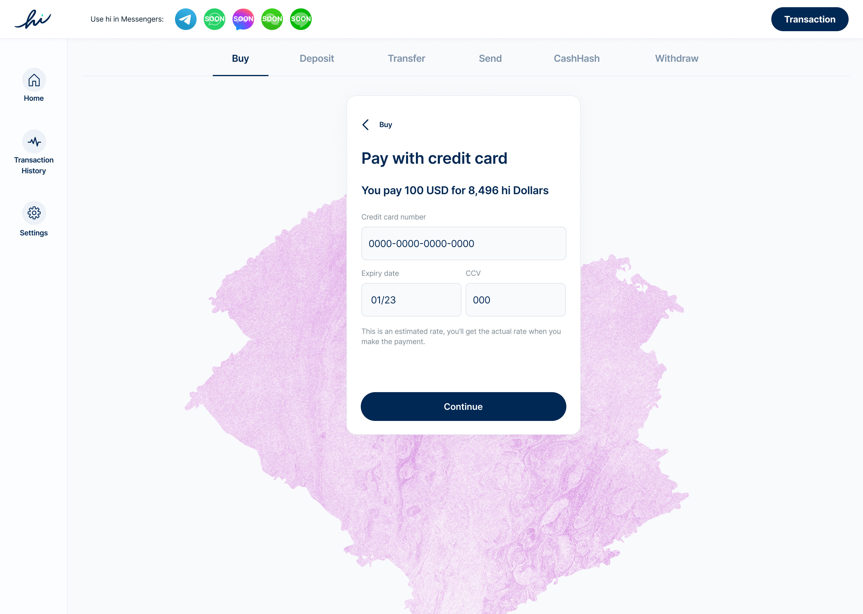
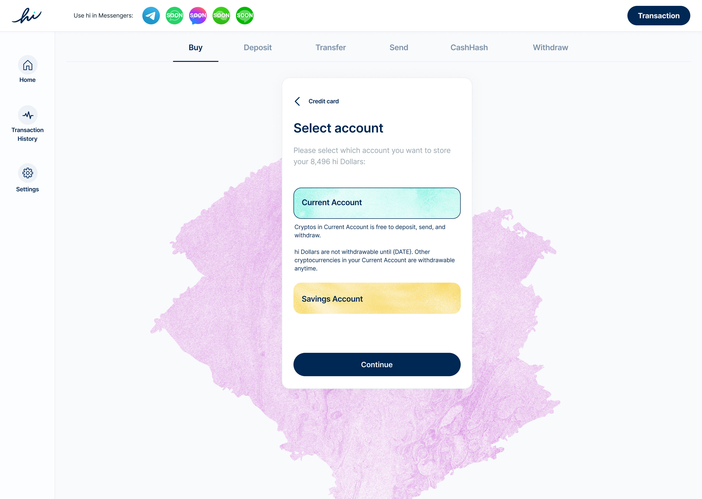
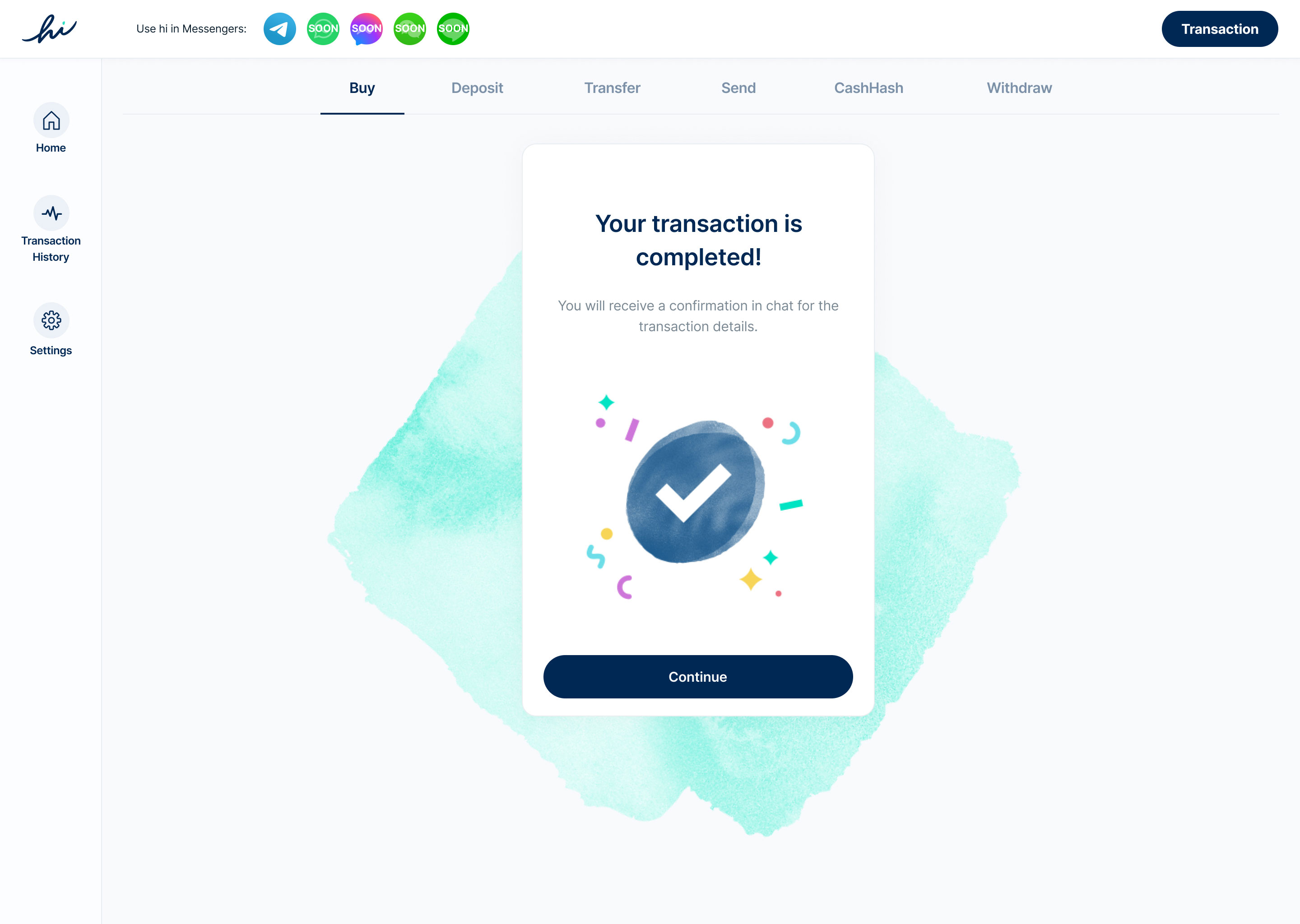
The app allows users to buy, transfer, cash hash and withdraw their cryptos respectively. Fiat or other cryptocurrencies can be used in various transactions.

As the name states, this is where users can review their transaction records, including time, amount and action type.

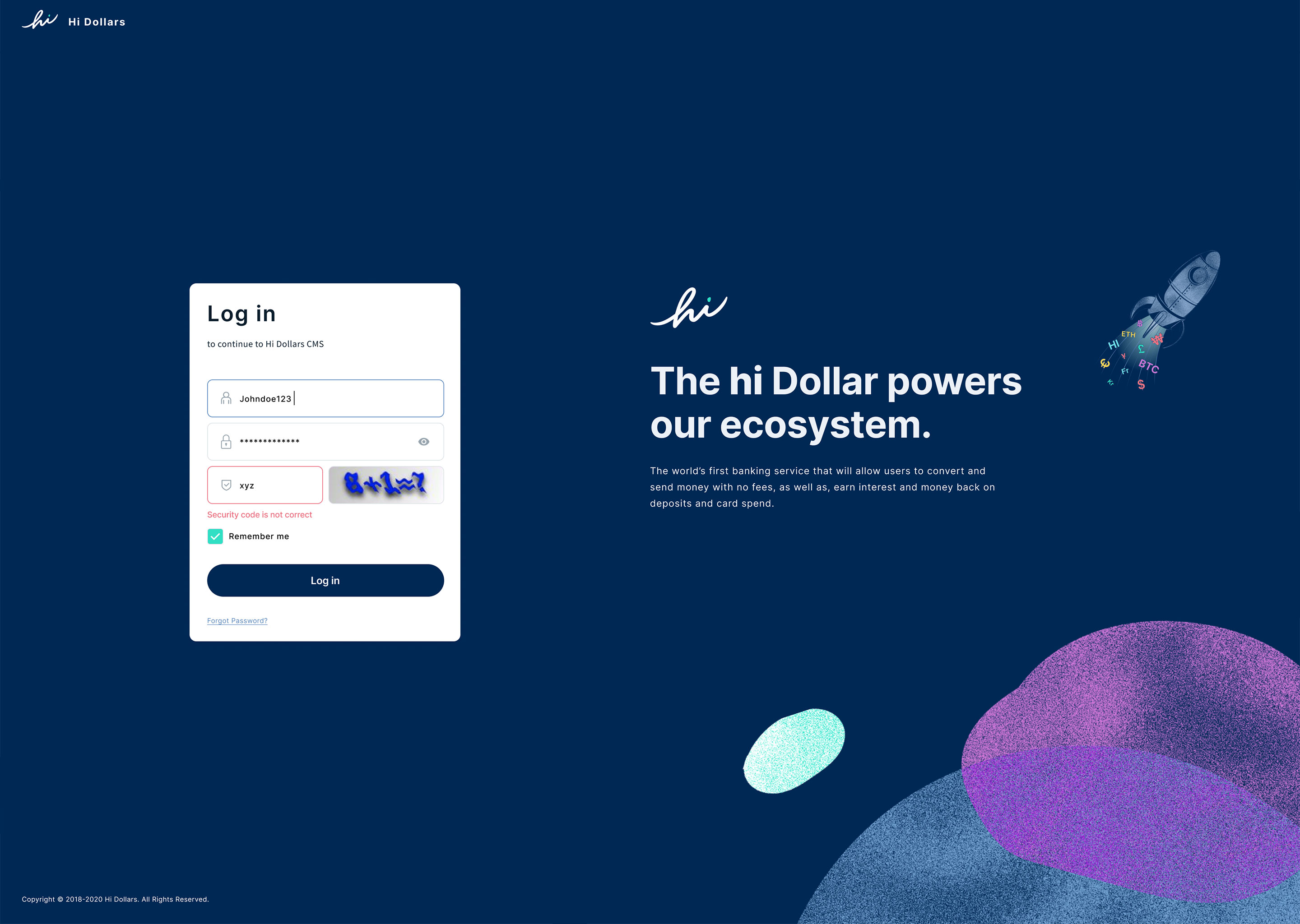
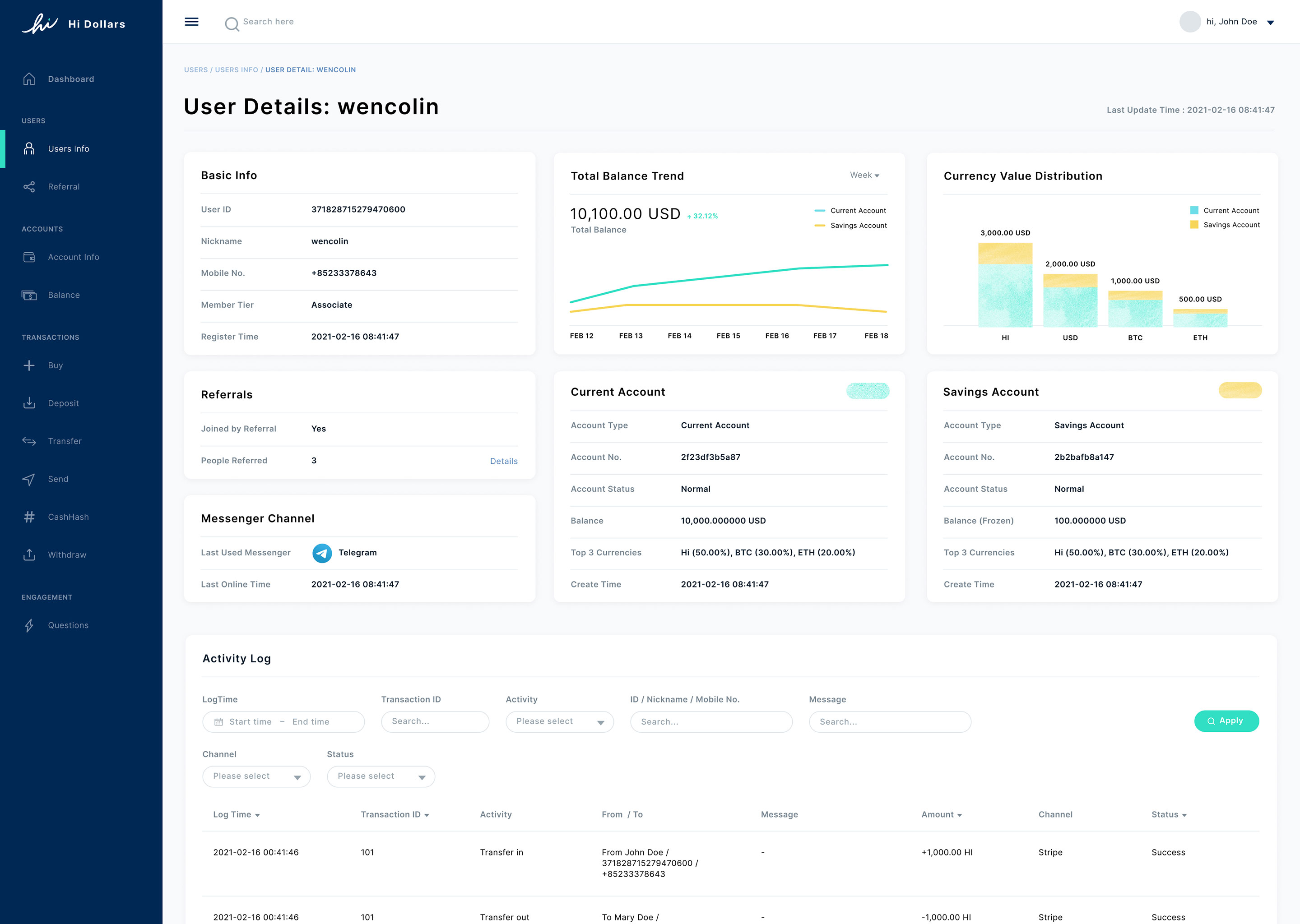
Besides the actual app, a CMS is also crucial in order for the app to operate smoothly. For different app features, there are different controls and data type to capture. I condensed the data and user various charts and tables to display them clearly.
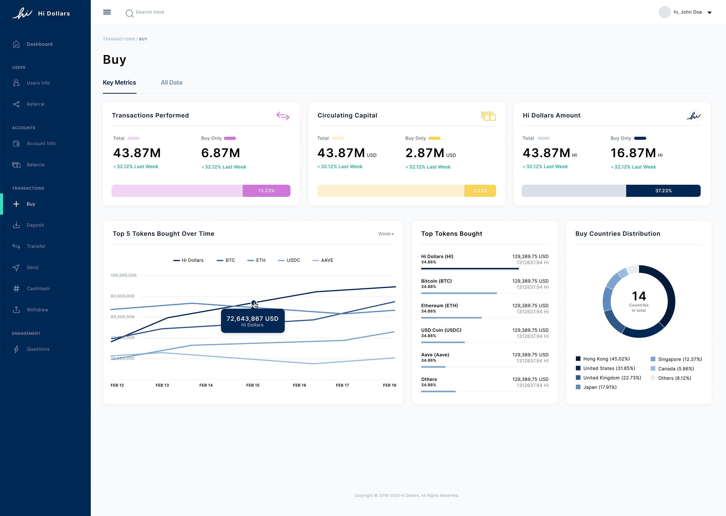
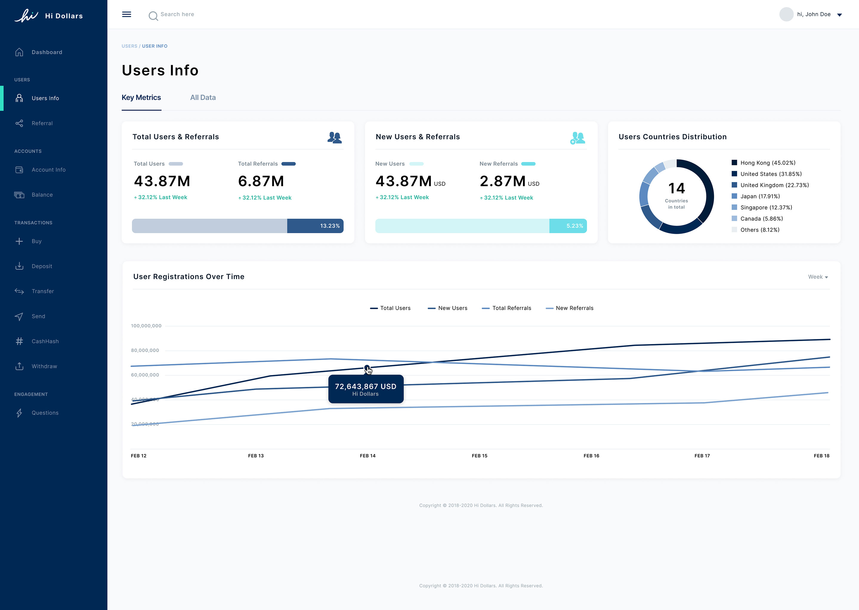

The application is designed with ease of use in mind, thus the overall structure is aimed to be as minimal as possible. Below is a simplied user flow to showcase the major screens and actions users will encounter within the application.
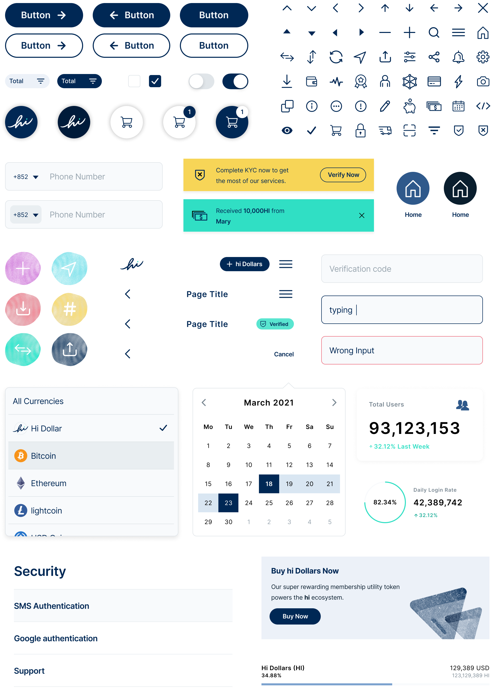
Components
A set of style guide and component library was developed along the way, to help unify the entire design and keep the application expandable, so as to help achieving a more efficient maintenance and update for future.

| Designer | Horace Ng, Houston Collective Team |
| Project Type | Commercial |
| Expertise | UX/UI Design |
| Year | 2022 |
